Editor layouts
Predefined layouts for each job type
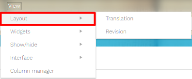
Once you enter the editor, a preferred layout for you will be displayed by default, adapting the working space to the needs of your task. This means that the columns of the editor and the widget panes will be ready for you to use. This kind of setup is just a proposition that you can still modify to your own preferences inside the <View> Tab in the main menu. You will find more details about each category in the next chapters about Column Management and the Widgets.

Translation view

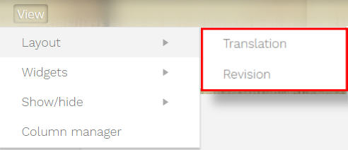
Once you enter the editor, a preferred layout for you will be displayed by default, adapting the working space to the needs of your task. This means that the columns of the editor and the widget panes will be ready for you to use. This kind of setup is just a proposition that you can still modify to your own preferences (you will find more details about each category in the next chapters about Column Management and The Widgets). These are the layouts available for work:
For revisers, the default columns displayed will be the source and the target languages.
The predefined widgets will be the Properties pane and the Timeline.
Other options that can be configured in the <View> tab include the way information is displayed:
in the segments:
- errors: segment information about QA checks
- formatting marks: to clearly identify spaces and other elements displayed during the text production
- last editor and date: to have them directly available at segment level
- Tags
in the interface, if you want to maximize the working surface available:
- compact segment view (default): displays the areas of work floating over your personal background.
- Remove editor borders: will allow you to work full screen with no margins or empty spaces.
- Row view: if you want to swap the way columns are displayed into rows.
Go back to Visual Features section
