
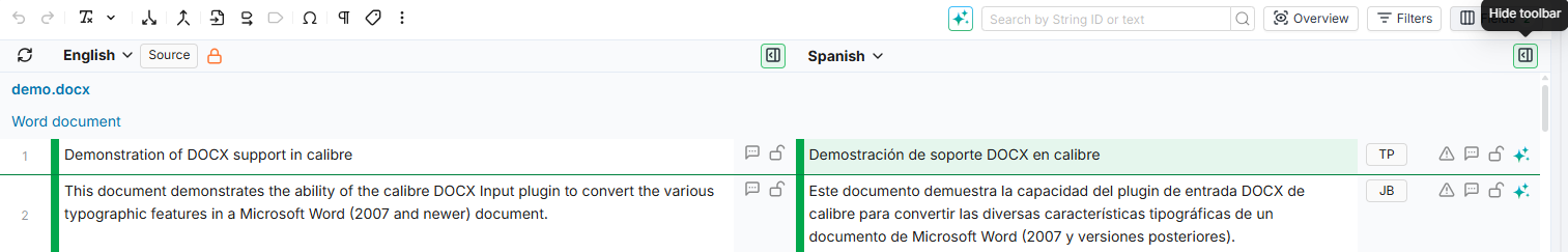
The grid is the core workspace of the Editor. It displays your content in a multi-column layout where source text, translations, and metadata appear side by side. Each row represents a segment, and columns show the source language, target languages, and any additional fields you have enabled. Alongside the grid, the Editor provides a set of side panels that give you access to tools like translation memory lookups, terminology checks, quality assurance, and more. You can open multiple panels at the same time, stack them, or collapse them out of the way.
This page covers some of the main features available in the grid.
Navigating the Grid
The grid supports infinite scroll: segments load continuously as you scroll down, with no page breaks or pagination. New segments are fetched automatically as you approach the bottom of the currently loaded set.
Infinite scroll is enabled by default but can be turned off in Preferences > General > Infinite scroll. When disabled, the grid uses traditional pagination.
The total segment count is displayed in the bottom-right corner of the grid. If you have active filters or a search query, this count reflects only the filtered results.
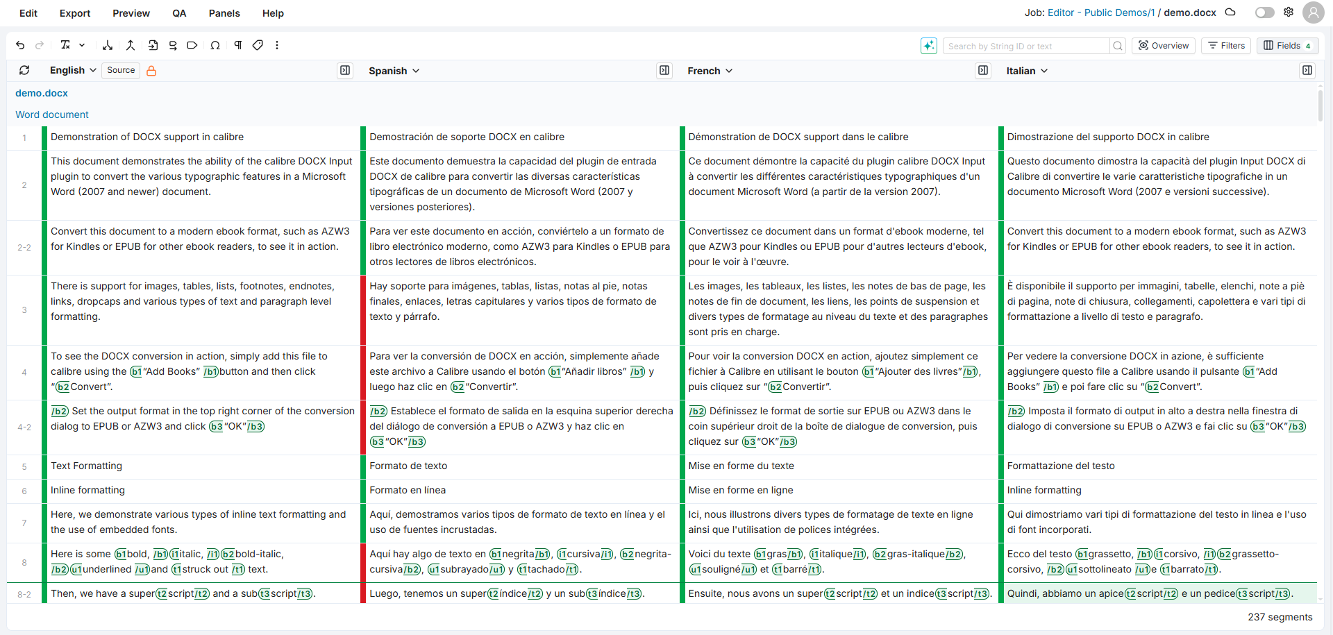
Working with Panels
The Editor provides a set of side panels that open alongside the grid and give you additional context for the segment you are working on. To open a panel, click its button in the top toolbar or select it from the Panels menu.
You can open multiple panels at the same time. Panels stack vertically on the right side of the grid and can be reordered using the up/down arrows in each panel header. Use the collapse toggle to minimize a panel you want to keep open but out of the way. You can also collapse the entire sidebar to maximize the grid area. The Preview panel can be detached into a separate browser window for multi-monitor setups.
The available panels are: Fields, Memory Finder, Term Finder, QA, AI, Batch Actions, Preview, and Assets.
Several panels give you context on the selected segment:
-
Comments Panel: Read and add segment comments.
-
Properties Panel: View segment and language metadata.
-
Revision History Panel: Browse and restore earlier versions of a segment.
-
Timeline Panel: See a log of metadata changes.
For a full description of each panel and how to manage them, see Panels.
Quick Toolbar
The quick toolbar is positioned above the grid and gives you fast access to common editing actions with a single click. Hover over any button to see its name and keyboard shortcut.
The toolbar includes actions such as Undo, Redo, Copy source to target, Copy markup to target, Insert tag, Insert symbol, Toggle whitespace, and Labels. When working with job documents, additional actions appear for text formatting (bold, italic, underline) and splitting or merging segments.
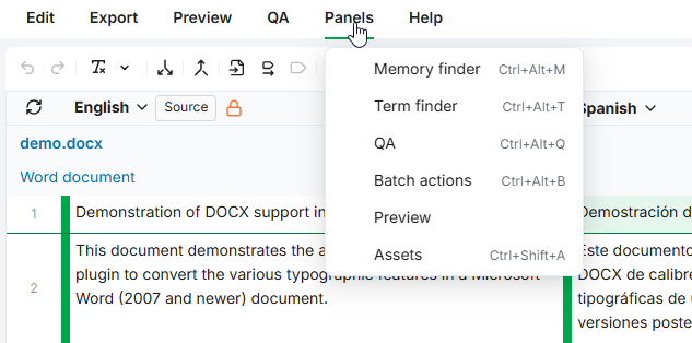
Click the more actions button (three vertical dots) on the right side of the toolbar to access additional operations like setting the translation status, assigning bookmarks, defining character limits, and propagating translations.
For a full reference of every action and its behavior, see Quick Toolbar.
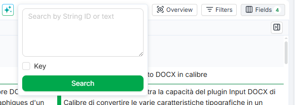
Search Bar
The search bar is located above the grid in the top-right area of the Editor. It lets you quickly narrow down the segments displayed by searching for text or filtering by specific string IDs.
Two search modes are available:
-
Keyword Search: finds segments containing partial matches to your query in any of the currently visible languages.
-
Key Search: filters by one or more specific string IDs.
For more details on search modes and on the full filtering capabilities, see Filtering and Searching.
Segment Toolbar
The segment toolbar is a compact column displayed next to each language column. Both the source and each target language have their own toolbar. It shows key information at a glance (translation origin, QA issues, character limits) and gives quick access to common actions like locking segments, commenting, and editing with AI assistance.
To show or hide the toolbar, click the toolbar toggle button in the column header for the language you want to adjust. The toolbar state is remembered per language.
For a full reference of every icon and action, see Segment Toolbar.
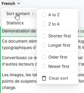
Sorting Content
You can sort the grid by any language column to organize segments in a way that suits your current task.
To sort by a column:
-
Click the language name in the column header. A dropdown menu appears.
-
Click Sort content and select a sort option from the submenu.
The available options are: A to Z, Z to A, Shorter first, Longer first, Older first, Newer first, and Clear sort.
Only one sort can be active at a time. Sorting applies to the segments currently displayed in the grid.
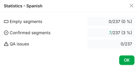
Viewing Statistics
Each language column provides a quick statistical overview of translation progress: how many segments are empty, how many have been validated, and how many have QA issues. Each metric is clickable and applies the corresponding filter so you can jump straight to the relevant segments.
To view statistics, click the language name in the column header and select Statistics.
-
Empty segments: Segments where the translation for this language is blank
-
Validated segments: Segments with a confirmed (green) status for this language
-
QA issues: Segments that have at least one QA issue flagged for this language
Each metric count is clickable when its value is greater than zero. Clicking a count opens the Filters panel and applies a filter matching that metric for the selected language.
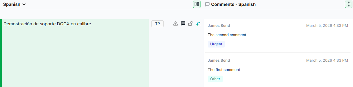
Expanding and Collapsing Comments
When comment columns are visible in the grid, you can expand or collapse them to control how much space they use. Collapsed comments show a compact view, while expanded comments display the full content including author, date, and text directly in the grid.
Click the expand/collapse icon located between the comment column headers to toggle between the two views.
Insights Column
The Insights column displays QA issues directly in the grid, so you can review flagged segments without opening the QA panel. Each target language can have its own Insights column showing only the issues for that language.
To add an Insights column, open the Fields panel and select Insights - {Language} from the available fields list. The column is not loaded by default.
Collapsed and Expanded Views
The column supports the same expand/collapse behavior as comment columns:
-
Collapsed (default): Each cell shows a summary such as "7 issues - 2 ignored". Empty cells appear when the segment has no QA data.
-
Expanded: Each cell shows full issue cards with the severity icon, rule name, and description. Use the expand/collapse toggle in the column header to switch between views. You can also expand or collapse individual cells independently.
Managing Issues
Each issue card in the expanded view includes actions to manage the issue directly:
-
Mark as resolved: Confirm that the issue has been addressed.
-
Ignore: Dismiss the issue. You can also select Ignore with note to add a reason.
Dismissed issues appear with a different background and show Undo and Note buttons.
Filtering by Severity
Click the settings icon in the column header to open a filter popover. Use the severity buttons (Error, Warning, Info) to show or hide issues by type. A Show Ignored toggle controls whether dismissed issues appear. Filter state is per-column and persists during your session.
QA Flag States
The QA flag in the segment toolbar reflects three states:
|
State |
Appearance |
Meaning |
|---|---|---|
|
No issues |
Outline triangle icon |
No QA issues found for this segment. |
|
Active issues |
Solid triangle icon |
One or more active QA issues exist. |
|
All ignored |
Ban icon |
All QA issues exist but have been dismissed. |
Clicking the QA flag opens the QA panel with the issues for that segment.
[Screenshot needed here]
The Insights column expanded for French, showing QA issue cards with severity icons, rule names, and action buttons.
Revision History Column
The Revision History column shows each segment's revision history directly in the grid, so you can see who changed a segment, when, and how without opening the Revision History panel. Each target language can have its own Revision History column.
To add a Revision History column, open the Fields panel and select Revision history - {Language} from the available fields. The column is read-only and not loaded by default.
Collapsed and expanded views
-
Collapsed (default): each cell shows a short summary such as "3 revisions - last by Anna, 2 hours ago". Hover to see the exact date.
-
Expanded: each cell shows the full list of revisions as cards, with the same change highlighting as the Revision History panel. Use the toggle in the column header, or expand individual cells.
Cells are blank for segments with no revisions in that language. Only one expandable column can be expanded at a time: expanding Revision History collapses the Comments or Insights column, and vice versa.
The Revision History column is read-only. To restore a past revision, open the Revision History panel.
[Screenshot needed here]
The Revision History column expanded for French, showing revision cards with author, date, and change highlighting.
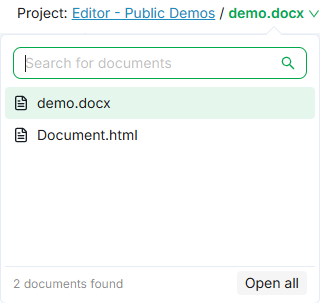
Document Selector
The top bar of the Editor indicates the current scope type (Project, Job, or Flex) and the document name.
The scope label also includes a clickable link to the job or project: click it to navigate directly to the corresponding page in the TMS.
When the scope contains multiple documents, you can use the document selector dropdown to switch between them, open all documents, or select a specific group of documents using checkboxes. For full details, see Document Selector.
Auto-Save
The Editor saves changes automatically. A cloud icon in the top-right corner of the toolbar indicates the current save state: Grey (no pending changes), Orange (saving in progress) and Green (changes saved successfully).
You do not need to take any manual save action. Once the cloud icon turns green, your changes have been stored.
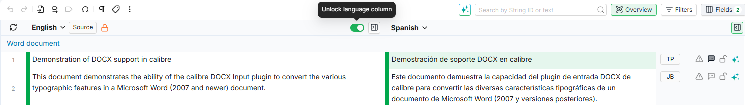
Locking Columns
The source column is locked by default to prevent edits. When a column is locked, a lock icon (padlock) appears next to the language name in the column header. If you have the necessary rights, hovering over the column header reveals a toggle to lock or unlock the column. Both source and target columns can be locked.
Resizing Columns
You can adjust the width of any column by dragging its border, similar to resizing columns in a spreadsheet.
Follow these steps to resize a column:
-
Hover over the right border of a column header. The cursor changes to a resize indicator.
-
Click and drag left or right to make the column narrower or wider.
Only the column you drag changes width. Other columns are not affected. If the total width of all columns exceeds the viewport, a horizontal scrollbar appears automatically. If columns are narrowed so their combined width is less than the viewport, empty space appears on the right side of the grid.
Each column has a minimum width that keeps header icons visible without overlap.
Your chosen widths are saved automatically for the current job or project scope. If you reload the page, navigate between pages, or reopen the same job later, your widths are restored. Opening a different job starts with the default equal-width layout.
To reset all columns to their default widths, open the grid settings dropdown (where density and tags mode are configured) and click Reset all column widths.
[Screenshot needed here]
The grid with the resize cursor visible on a column header border, showing the drag-to-resize interaction.
[Screenshot needed here]
The grid settings dropdown showing the "Reset all column widths" option.
Working with Markup Tags
When translating documents that contain formatting tags, you can drag tags from the source column and drop them into the target column within the same segment. This copies the tag into the target text at the cursor position without modifying the source.
Follow these steps to drag and drop a tag:
-
Click on the target cell to enter edit mode.
-
In the source column of the same segment, click and hold a markup tag.
-
Drag it to the desired position in the target cell and release.
The target cell highlights when a valid drop is possible. Tags can only be dropped into editable target cells within the same segment row. You cannot drag tags from target to source, across different segments, or into locked columns.
You can also insert tags using the Insert tag button in the Quick Toolbar or by using the Copy markup to target action.
[Screenshot needed here]
A markup tag being dragged from the source column into the target cell of the same segment, with the drop position highlighted.
Editing Metadata
When metadata columns are visible in the grid (configured via the Fields panel), you can update custom fields, labels, and other segment properties directly in place without leaving the main view.
Follow these steps to edit a metadata field:
-
Click on the metadata cell you want to edit. The cell highlights with a colored border.
-
Make your change. Depending on the field type, you may type text, select a value from a dropdown, toggle a checkbox, paste a URL, or upload an image.
-
Click outside the cell or navigate to another cell. Your change is saved automatically.
You can reverse or reapply recent changes using the Undo and Redo buttons in the toolbar, or with the keyboard shortcuts Ctrl+Z and Ctrl+Y (on Mac: Cmd+Z and Cmd+Y).
Editing metadata requires the appropriate access rights. If a field appears read-only, contact your project administrator to verify your permissions.
Preferences
The Editor includes a Preferences dialog where you can configure your workspace. Click the gear icon in the top-right corner of the Editor to open it.
Available settings include:
-
Propagation behavior: control how translations are propagated to repeated segments.
-
Infinite scroll: toggle between continuous scrolling and pagination.
-
Theme: switch between Light mode, Dark mode, or match your browser's setting.
-
Keyboard shortcuts: view, customize, and reset shortcuts for all Editor actions.
All preferences are saved per user and remembered across sessions. For full details, see Preferences.
Learn More
-
Segment Toolbar: Complete reference for all toolbar icons, indicators, and actions.
-
Quick Toolbar: Full reference for all quick toolbar actions and keyboard shortcuts.
-
Fields Panel: Choose which columns appear in the grid and save custom presets.
-
Filters Panel: Narrow down the segments displayed using filters.
-
Document Selector: Switch between documents within your project or job.
-
Panels: Open and arrange side panels alongside the grid.
-
Preferences: Configure display options, infinite scroll, keyboard shortcuts, and theme.